Urigins
Crafting intuitive and visually appealing digital experiences that prioritize user needs and business goals.
Discovery phase
Urigins is a digital platform that allows users to trace and visualize their family trees, connecting personal histories through an intuitive online interface. During the discovery phase, I worked closely with the founders to understand their mission: making genealogy more engaging, approachable, and modern. We identified key values (heritage, connection, and growth) that would shape both the brand identity and the user experience. This stage also included reviewing competitor landscapes to ensure Urigins would stand out in a traditional and often overly formal market.
Ideation Development
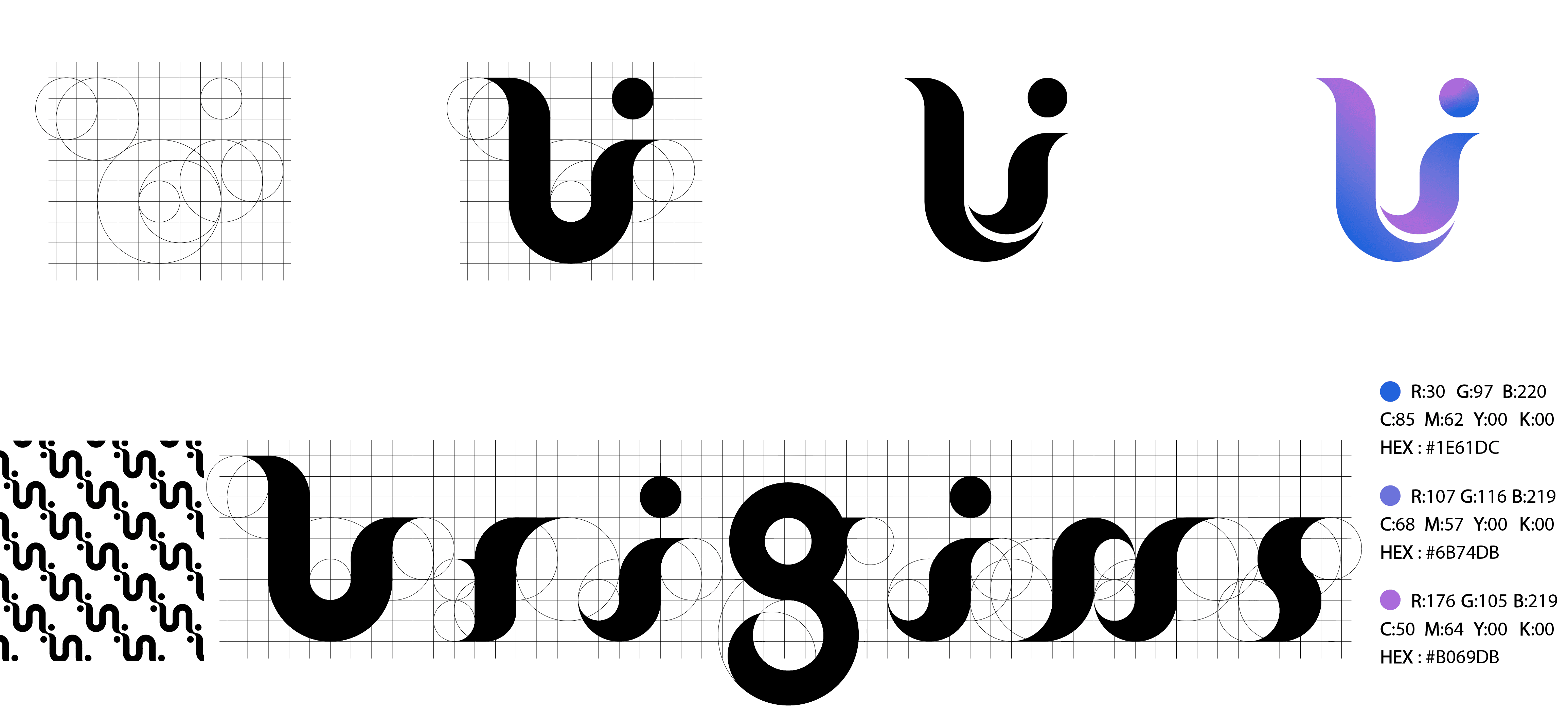
The challenge was to convey both the technological aspect of the platform and the deep emotional resonance of personal history. Early sketches explored abstract representations of roots, branches, and pathways, eventually converging on a symbol that combined a stylized “U” with organic curves and circular forms reflecting continuity, lineage, and inclusivity.
I developped typography by following the same philosophy, using geometric proportions to create a cohesive, memorable wordmark that complemented the icon.
UX Research
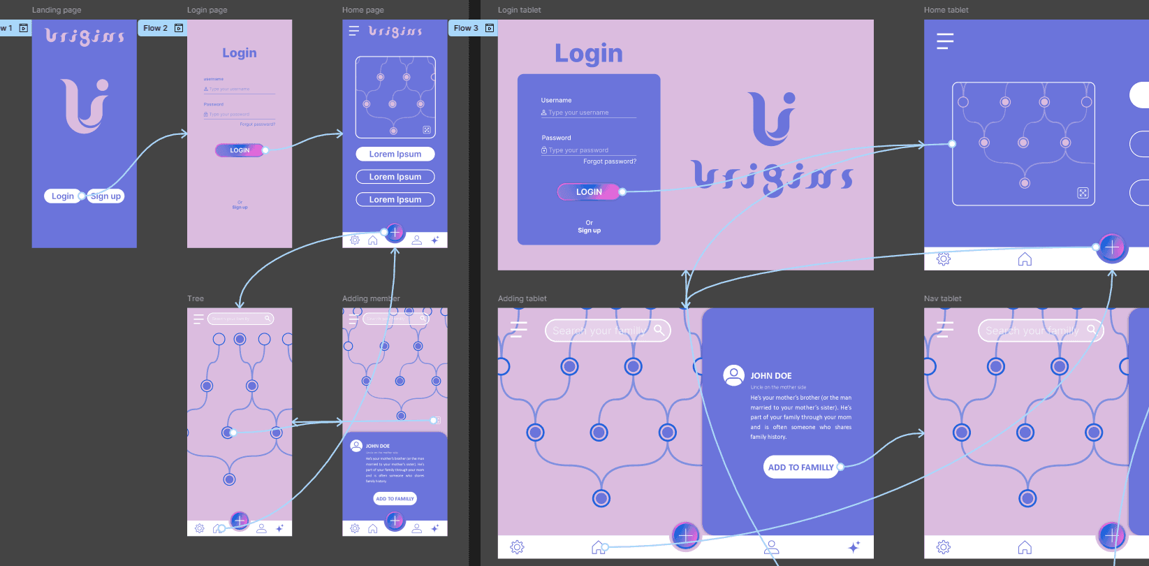
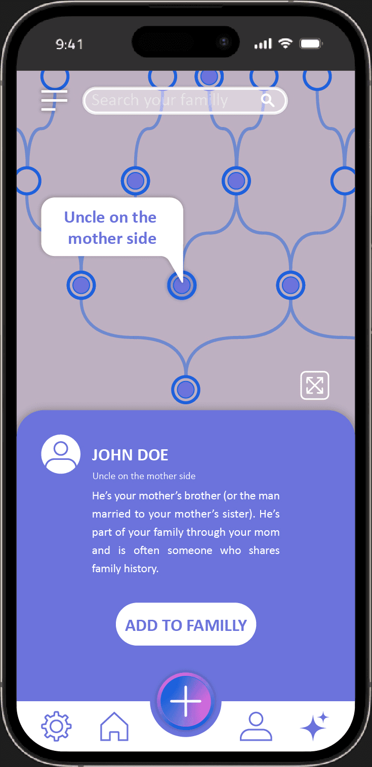
Userflow: From early interviews and task analysis, three core userflows were identified: Explore - Visually browse the family tree to understand relationships. Identify - Select a family member to view contextual information. Expand - Add new relatives and connect them correctly within the tree. These UXflows informed a non-linear navigation model, allowing users to jump freely between exploration and contribution without breaking context.
Constraints: Cognitive load: Family trees can become visually complex very quickly Scalability: The interface needed to scale from small to large families Personas: The Curious Explorer: Wants to understand family connections and history with no effort. The Occasional Contributor: Adds information sporadically and needs clear guidance.
Design System
Low-fidelity wireframes focused on hierarchy and spatial organization: A node-based tree structure as the primary navigation element, clear CTAs. The family tree remain the central element at all times. Interactive prototypes: Smooth transitions between nodes and detail views. Progressive disclosure of information to avoid overwhelming users.
User Journey: Adding a member: The user selects a node → taps “Add to family” → assigns the relationship → sees the tree update instantly. Exploring: The user pans and zooms across generations, maintaining orientation through consistent visual patterns.